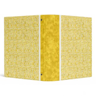
Today I thought I would ask some friends for inspiration. I sent a message out asking for a color and a basic shape, the first one that responded would get the honors (though until now they did not know what that honor would be)
The first response I received was the color yellow and the shape was square. It came from Shannon Justice of Lollipop Labs Studios, a very talented artist in her own right.
So square it was and yellow, well let's just say it was a bit of a challenge. Although yellow is one of my favorite colors it is very hard to not make it glaringly bright. I started out by playing with a few yellow colors, some on the green side some a bit toward orange with nothing quite doing it. I opened Illustrator up and began drawing squares and that didn't work either so I cheated a little and used the rounded rectangle shape to make a pattern in Illustrator. Back to Photoshop. When all else fails start playing with filters, adjustments and distortions.
I began with a slight noise filter to break up some of the solid color and then applied a cubism effect which turned the noise into a random pattern of squares. I brought the rounded rectangles into Photoshop placing them on top of the yellow background. Still it wasn't right so I thought I would select the rectangles and cut the shape out of the yellow background. I thought some white was needed to break things up and added a white stroke. After playing around with it for a few hours I am happy with it and I began to post it on Zazzle.
Now you might ask what honor did Shannon receive for this little game of mine? Well the design is named after her of course.


Excellent! Lucky Shannon :) (I really must learn how to use Illustrator!)
ReplyDeleteWhat a beautiful binder Nikki! Can't believe I've missed it. I find yellow to be one of the hardest colors to work with but you've done a fantastic job with this. :)
ReplyDeleteI see you like playing with your Photoshop filters like I do. I haven't got a clue what half of them do but if the outcome looks good... what the heck!