Showing posts with label watercolor. Show all posts

Wednesday, December 15, 2010

Getting Ready For The Golden Globes

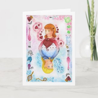
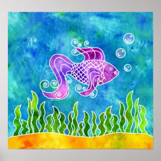
A little more than a month away and I will be heading out to Los Angeles for the Golden Globes. The past few weeks have been very busy with putting together my submissions for the gift bags. I decided to go handmade for this event and made glass pendants featuring my work.


I had to make 100 of them which really meant 150 because I allowed for error since this is the first time I am making them. There were a few duds that have been tossed aside and only the good ones remain to be given. It was quite a learning process.

To present them I have small Kraft and Chocolate boxes in which I attached (alright hand-cut and glued) each label then closed with some raffia ribbon. Inside I included a necklace tucked in a small paper bag so it doesn't rattle around, my business card, a sample of my work and a coupon for OnceUponAPuzzle.com where I illustrate puzzles.


Two days after I get back from The Golden Globes I head out to Utah for the Sundance Film Festival and I am really looking forward to that. My only regret is that I won't be able to see any of the films while I am there but I will be sure to take note of them. The place it is being held at is absolutely stunning and I wonder if there is a broom closet I could stay in for I would happily do just that to wake up to the view the hotel looks over because it is simply stunning.


For Sundance I have chosen bottle cap pendants, or maybe I might do a mix for both events, I have not decided yet. The bottle caps will go on ribbon necklaces as opposed to the ball chain ones. I like the glass pendants better only because they are a little bit more low key and that is just my personal taste, The bottle caps are a bit more funky. Sundance sort of snuck up unexpectedly and had I had more time I would have made something completely different. I am saving that idea for the MTV Movie Awards, Emmy's or AMAs, as there are a few more events coming later in the year and I will be better prepared for it.

I am not sure who will show for either Sundance or the Golden Globes though I have heard some rumors. I have two people in mind I would love to meet, chances are slim but I know I will have a great time at both events. I will be sure to post photos as soon as I have them.


Sunday, November 21, 2010

Poinsettia and Holly Christmas Stocking Kit


Poinsettia and Holly Christmas Stocking Kit


It is that time of year when everyone busies themselves with crafts for the holidays cutting, sewing, gluing and don't for get the glitter. Recently Spoonflower had a contest and here is my entry. It is made to go on a full yard of fabric so there was enough room to make two stockings. One large and the other a bit smaller. There will also be one that is available on a fat quarter of material. Once the colors have been approved I can release it to be sold on Spoonflower and it shouldn't take too long. If you do happen to order one of these for yourself please send along a photo of the finished project. I would love to see it and of course share it!

If you really like my kit won't you please stop by and give it a vote?

All you have to do when you get to Spoonflower is find my design and click it to turn it green, then go to the last page and save your vote! No registration is needed and you can vote as many times as you like until the end of the contest. Thanks again and Happy Crafting!


.

Tuesday, December 15, 2009

Alice In Wonderland


I don't know many people that have not been inspired by Alice In Wonderland, there are many movies, games, tv mini series and artwork out there all depicting Alice and her menagerie of characters that travel through Wonderland with her. While watching SyFy channels Alice series I was inspired too, well, sort of.

I have always wanted to design a set of playing cards featuring different fairy tales or animals and I guess the thought hit me the other night. Now most of what has been out there lately has been very dark and goth looking, American McGee's version comes to mind. Now don't get me wrong, I love those versions immensely but since I have been endlessly painting in red, green and white for the holidays I wanted to use color. My mind also tends to live on the dark side of things so that is another reason I shy away from creating darker artwork.

Although people are not a strong point for me to draw or paint I attempted and Alice and Queen of Hearts card. I am not sure why people are so hard for me to depict, perhaps it is because I never really learned or maybe it is just not one of my favorite things to do. I tried to give it an old fashioned card feel, an expressionless face staring off in the distance and I think I achieved that.

I started out making a short list of things that stuck out for me in the story and then cut it down to a few subjects. I lightly sketched the outside of the card with those objects trying to keep Wonderland and Alice's world separate to an extent. I always loved Dinah so I made sure she was in there. The flamingos are a favorite too and of course the Cheshire Cats grin. I tried to fit the Mad Hatter in there but the only thing that made it into the final design was his hat. Add the White Rabbit and his pocket watch, a dancing tea set, and of course the looking glass and I had my outside design.

The harder part was getting Alice and the Queen to align. I drew a grid and that helped but I was having such difficulty with Alice's dress lining up with the Queen's cape so I had no choice but to give Alice a cape too. I thought about making the Queen older but it sort of looked out of place so I made her about Alice's age and I think it worked ok.

This is my first attempt at trying something like this. I would like to do more fairy tales, perhaps I think I might attempt a Mad Hatter/Cheshire Cat card next...hmmm....

Alice Playing Card Bag bag
Alice Playing Card Letterhead letterhead


.

Tuesday, December 1, 2009

How to Illustration

I thought perhaps you would like to see one of my illustrations broken down from concept to completion so I chose the newest one I just finished this morning. It is called Sleigh Ride and it came about because I was thinking of my two favorite comic strips, Peanuts and Calvin And Hobbes and remembering two seperate moments in time, one with my family and one with someone who is still very dear to me.

(I would like to appologize about the quality of the photos, My camera battery was dead and I used my cell phone)


While talking to a friend I began to doodle on a scrap piece of paper in ink. Originally I had them on a sleigh, flat along the ground but I was thinking of Calvin's wonderfully imaginatve situations he would put his snow people in (sans decapitated heads) and I began to draw two snowmen hanging on for dear life while riding down a snowy hill. The third one came about as I glanced at a photo of my family. In it was my sister, my mother, my father and me on Splash Mountain in Disney World (it happens to be the last photo we all took together before my parents passed away) My sister and mother had their eyes squeezed shut in slight terror while my dad and I had the biggest grins on our faces. So in went the snowman, arms up, having the time of his life. It needed a little bit more though and as a kid I always laughed when Snoopy took Linus' blanket away and he would go flying in the air or when Charlie Brown would kick the football and miss (though I never found that funny and Lucy has never been a favorite of mine) So in went this poor little fellow that had the unlucky spot of the back of the sleigh, hats flying and everything.


Next step was to lightly sketch it on watercolor paper and ink in the lines with a Sakura pen


Now came in laying down the blue. I chose Cerulean Blue as it has a bit of green to it and makes a perfect shadow color. One of the most frequent mistakes people make is using black for shadows. If you look at snow or most things in general they cast a shadow and sort of reflect the sky and sometimes perhaps the trees. I am not saying that shadows can never be black however it really depends on what is around your subjects


Next step was to start laying down color, What I like to do on occasion is to draw in the shadow areas and bleed them out. This works well for illustrations and I do not always paint this way.


After that I went in and began bleeding the paint with a light wash of color.


I then added detail and here you have the final illustration. I hope it makes you smile, there are quite a bit of memories in here, maybe you can see some of your own as well. Oh and to my friend, now you know what I am doing when I am talking to you then suddenly go silent for a moment, I am sketching away with tongue slightly hanging out the side of my mouth.


.

Friday, October 30, 2009

When Life Gives You Gloppy Frisket...

Use Illustrator


I love the idea of frisket, my problem is that it glops up too fast and buying it is a waste of money. Even though I seal the bottle in two zip lock bags and carefully clean the lid and lip of the jar the cap still manages to seal itself shut like a vice grip. After about ten minutes of working at the cap and finally getting the darn thing open I found that my frisket was a gloppy mess as usual. After having removed most of the gooey-ness I began a painting that I woke up with in my head of a little fish.


I love batik and I used to do it all of the time in high school way back when, I love the way it looks and at first I was going to create my very first design of a stork among tropical foliage. Painting a sort of faux batik using watercolor and friskit but somewhere in between it turned into a tropical fish that I must have dreamed about the night before.


Now the original painting was good with exception of the above mentioned friskit. The lines were just too much of a mess to fix and I found myself getting annoyed beyond anything. I was about to scrap the whole idea when I thought "Why not take it into Illustrator and make the lines there and add the painting to it afterwards?"


That is exactly what I did and I think it came out successful. I scanned the original painting into Illustrator and cleaned up the lines by drawing them from scratch. I then moved it into Photoshop and scanned in four sheets of hand-painted watercolor, one each of yellow, green, ocean blue colors and purple. I placed the appropriate color behind the different sections of my new drawing and digitally cut it out. The end result is very close to the original painting only much cleaner. Maybe I shall recreate my very first batik just for the fun of it


Friday, September 18, 2009

J'Adore Paris Gets A New Look


I have come back from my first trip to Europe and the first vacation I have had in five years. I had a wonderful time and the people of Paris are friendly, nice and helpful (except for one grumpy waiter)


Paris is an artist's dream come true, everywhere you look is a painting or a photograph waiting to be captured. I had barely took a step without snapping a photo and all in all I took around 1,200 within the week. The challenge lied in having a very steady hand as most places do not allow flash photography or tripods understandably. I like shooting with available light above flash but in the darkness of some of the churches and buildings you had to become creative.


We managed to get a lot of sightseeing and might I add some extremely good food into the week. It took me 40 years to finally see Notre Dame, the setting for my favoriite book up close. It's beauty is so astounding I easily took over 200 of it alone. Père Lachaise Cemetery was also a highlight for me. It was an overcast day and the leaves on the trees are starting to turn colors and fall. Moss covers most of the tombs and cobblestones wind through a maze of around 300,000 graves.


Versailles was interesting. The castle was a bit much for me and did not hold my interest until I got out in the gardens back by the Hamlet Houses. I fell in love with the beauty of that whole area. It was as if a storybook had opened up and you walked right in. Little cottages lined the lake, a small mill, a spiral wooden staircase, cute little gardens fenced in with wooden gates and a farm with the most handsome, entertaining pig I have ever met. He honestly had me laughing the whole time. We ended up nicknaming him Jambon, the French word for ham, not because he was a pig but for the way he hammed it up for everyone passing by.

"Jambon"


The only thing I did not get to see because of a week long power outage was the catacombs. I was really looking forward to that but perhaps next time.

I have redesigned the store to better reflect the way I felt about Paris. I gave it a warm and inviting feel to it and I have begun to upload some photos and digital paintings. I have in the works a few watercolors that will be posted down the line a bit. I also plan on adding short stories to the photos I have already put up. It is a very big job so please be patient. I hope you enjoy what I have to show...


Zazzle's New Products


It seems that Zazzle had pushed back the relaese of the new products and they just released today. New letterheads, stationery, invitations and more can be found in my 13 Black Cats Designs store. Being away and not having access to a computer I was not able to update the progress of it all so I am sorry to leave you hanging in that sense.

Anyway it is back to posting my photos and catching up on some painting - Let me know what you think!


.

Wednesday, January 28, 2009

Penelope - The Lucky Black Cat

Penelope is one of my cats, or should I say I am her human. I wasn't inspired to paint today but out of the corner of my eye I caught Penelope staring at me. Although she does this often (which means she is looking for a way to get on my lap without being noticed) this time I grabbed my pencil and sketched her before she had that chance. I don't normally paint or sketch without a photo because for me it is easier when something doesn't move around. I gave it a try though and it sort of looks like her, not too bad for a first shot.

While I did manage to get the sketch almost completed before she moved in, the remainder of the painting was completed with her purring contentedly on my lap.

to be continued...

Saturday, January 24, 2009

New Watercolor Series


New Watercolor Series just uploaded to Greeting Card Universe. Today I thought I would play with some color and see what came of it. I began with a sheet of watercolor paper and dunked it in water to get it nice and wet. When it was semi dry I picked a handful of colors and directly from the tube I began to put little plops of paint all over the paper. I let the paint sit for a little while to get a bit of a crust on it then with a fine spray bottle I misted the paper and paint and watched the colors run together. Not wanting to have any white of the paper showing through I took a flat 1" paintbrush and helped the colors along, misting with water where needed until I was satisfied. From there, and after it had dried, I scanned the painting in and began to design some cards. For the cards on white backgrounds I simply typed in the sayings and shapes I wanted, selected the type and cut it out of the colored background, added a bit here and there and that was it, a very simple thing. I will probably be adding these designs to Zazzle and CafePress when I get a few more going.


Until then...


to be continued...

Saturday, January 17, 2009

Tiger - Silent Stalker

Well sometimes being blocked has it's advantages. Although I have managed to put out a small cow illustration I haven't painted anything really serious in quite some time. Not really knowing what to do with myself today I came across a photograph I took last year of a beautiful female tiger. The best part of the photograph was that there weren't any bars in the way and she was right up against the glass panel looking way across the other side of the enclosure at her sisters playing on the hilltop. I must say it was a once in a lifetime shot second only to photographing this beautiful animal in the wild. Anyway I kind of forgot about it until I was shuffling through some papers today and I was inspired.

I began with a rough sketch on Arches 140lb cold pressed watercolor paper, a paper I reserve for those special paintings because of the cost. When I was satisfied with that I used a small amount of frisket to keep the whiskers from disappearing. I don't like to rely on frisket to often but for this purpose I made an exception. Besides do you know how hard it would be to paint around those whiskers and still have a free brushstroke?

I began to lay in the color by layering light washes, begining with a light ochre and adding burnt sienna as I went along. When I was satisfied with the browns and ochres I began to use an ivory black (Most watercolorists do not use this color for reasons I never quite understood, I however embrace any color I can get my paws on) I started off with a wash of black in the general areas and began shading her fur. When I was ok with what I had I took a break to work on the eyes. Eyes can make or break a painting and I paid close attention to it. Bright yellow was layed in with a small amount of spring green to give them a sparkle only a cat's eye seems to have. A light shading of black to round them and carefully a painted iris leaving the highlight finished them off.

Now the fun part, the stripes. Using a wash of ivory and a relatively thin brush I lightly painted the stripes as if I was holding a pencil and sketching them in. I then softened the edges to make them rest into the fur.

Now the worst part, the background. How I hate this part, what to do? Shall I use the greens of the jungle and soften the background to suggest foliage or should I just keep it simple and compliment the neutrals of the painting so as not to distract the detail I worked so hard on or should I combine the two? At first I thought to combine the two add some olvie and forest greens to the dark sepia tones but as I began to paint I realized that keeping this simple and monotone was the way to go.

So that is how this painting came about. It took me about 2½ hours to complete, the original painting measuring 8x10, twice the size I normally paint. Hopefully you enjoy it.


Silent Stalker can be found on Zazzle, RedBubble, and Greeting Card Universe


to be continued...

Sunday, January 11, 2009

Spring's First Kiss

Since I am on the subjects of flowers and Springtime I thought I would give spotlight to "Spring's First Kiss"

It is an older painting I did 2 years ago from a photograph of some crocus growing in my backyard (sans unraked leaves and bits of snow)

The painting itself is bigger than I usually paint, around 9 inches square. I was at a bit of a loss as to what kind of background I should use for this painting since the one that was really there was much to be desired. Backgrounds are not my strong suit and I have to work hard on them, sometimes harder than the actual painting, I can't tell you how many paintings have been tossed aside because I messed up the background. I am definitately detail oriented and find spending hours on a flower much more rewarding than slapping on paint to complete something but it is a necessary evil for who wants an incomplete painting?

I decided to add a blurry dirt/moss background as that is 80% of what my backyard is comprised of (the other 20% is clover) I think it worked well Although if I had to do it again I would have used a deeper brown to make the crocus pop better.

Overall I am pleased with it's outcome and if you would like to purchase this design follow the links:


to be continued...

Thursday, September 25, 2008

New Carousel Painting

This past Tuesday I took a little day trip to Turtleback Zoo in West Orange NJ, I planned on taking some photos of the animals that live there but to my surprise I happened upon a beautiful carousel of endangered animals. Camera in hand and fingers crossed that the battery would not die before I could finish photographing each piece. I managed to get them in between rides and riders. The work on this carousel was exquisite and each animal unique in it's own right. There was a red panda, gorilla, dolphin, wolf, an otter laying on his back, an okapi, penguin, an elephant, bald eagle, polar bear, sea lion, seahorse, a giant panda, giraffe, ostrich, zebra, crocodile, a donkey and a tree frog. (pictured left) There were also several big cats including a snow leopard, lion, tiger, cougar and leopard. (I think I listed them all) I plan on painting many of the animals that are on this carousel in the upcoming weeks. I also plan on returning to get better photos for reference. The tree frog, I named her Lily, is available on Zazzle as of right now. She will be appearing very soon on CafePress so watch out for her.


to be continued...
____________________________________________________________
meow ^..^ meow ^..^ meow ^..^ meow ^..^ meow ^..^ meow ^..^ meow ^..^ meow
____________________________________________________________
Respect Copyrights.
No printing, lifting images or downloading without explicit permission from the author of this blog, Nikki Cutro.
©Nikki Cutro and 13 Black Cats Designs. All rights are reserved.